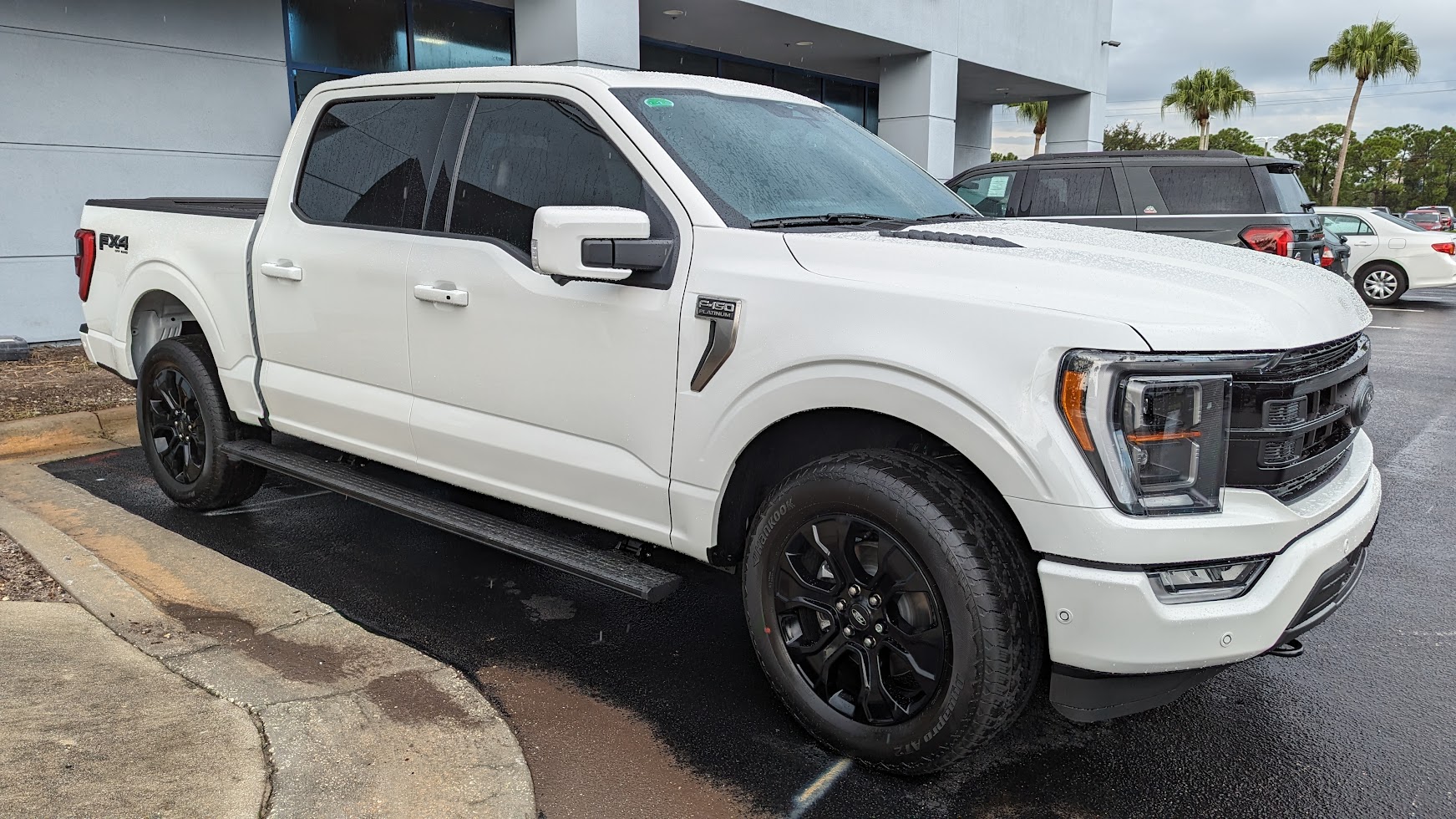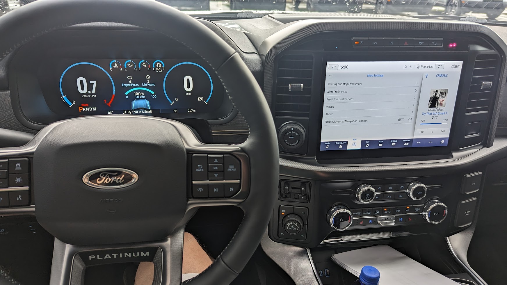

Next level of stupid. And I thought my wife's 2018 Lincoln Navigator's screens were distracting (I like to call her dash the 'neon lights and dancing elephants show').
And I'm not seeing any physical climate controls, so count me out. It's not that knob below the tranny buttons. That knob is the drive performance mode selector knob. On my wife's car it's behind the cup holders. And the six buttons around it are not for climate. One is for the hazard signal. Looks like the others are for accessories, which makes sense, because the accessory buttons used to be above the mirror, but now they're gone.
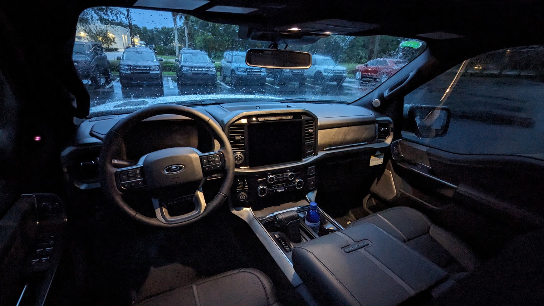
I can't wait until this era of 'let's make it look like a Tesla dash' is over, and we get back to practical styling. Until then, I'll keep my 2012 Navigator, with the classic chrome and faux burl wood accents, and analog-style instruments, with a simple 10 inch touch screen for the entertainment system.
This is what my wife's 2018 Navigator dash looks like (same as my wife's car but different colors), and even this I find distracting and there's a lot of animations and nonsense on the instrument cluster screen, but at least it has real climate controls, and there is also a heads up display, so honestly, I'm rarely looking at the instrument cluster screen when I drive her car.

I much prefer my 'old fashioned' 2012 Navigator Dash. This at least looks like a luxury car dash should, not like the inside of a Star Trek shuttle: